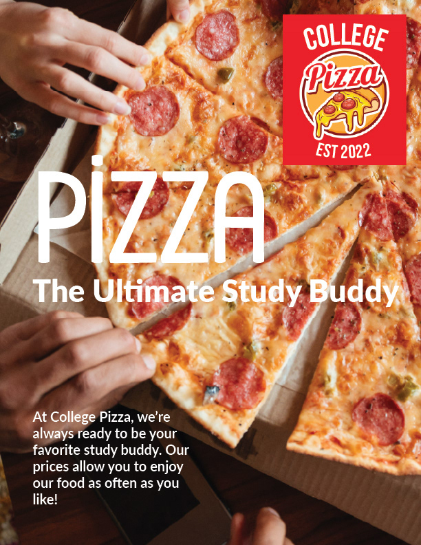
I was so excited to work on updating the "College Pizza" poster! The goal was to create a relaxed, budget-friendly vibe for the college crowd. The poster had to include fun phrases like "pizza," "the ultimate study buddy," and "at College Pizza, we're always ready to be your favorite study buddy. Our prices allow you to enjoy our food as often as you like," along with the College Pizza logo.
I had a blast coming up with different designs for the poster! I tried out a few ideas, like showing a group of friends enjoying an affordable-looking pizza. Including hands and a more budget-friendly pizza would capture the vibe we were going for.
Choosing the right fonts was straightforward. The brief indicated a preference for sans-serif fonts like Lato, which we used for the body copy and the subheading. For the more decorative text, I opted for a font called Rabito Regular, adding a touch of playfulness to the design.
I also had fun playing around with the placement of the logo in each of the four corners to see where it fit best in the background image.
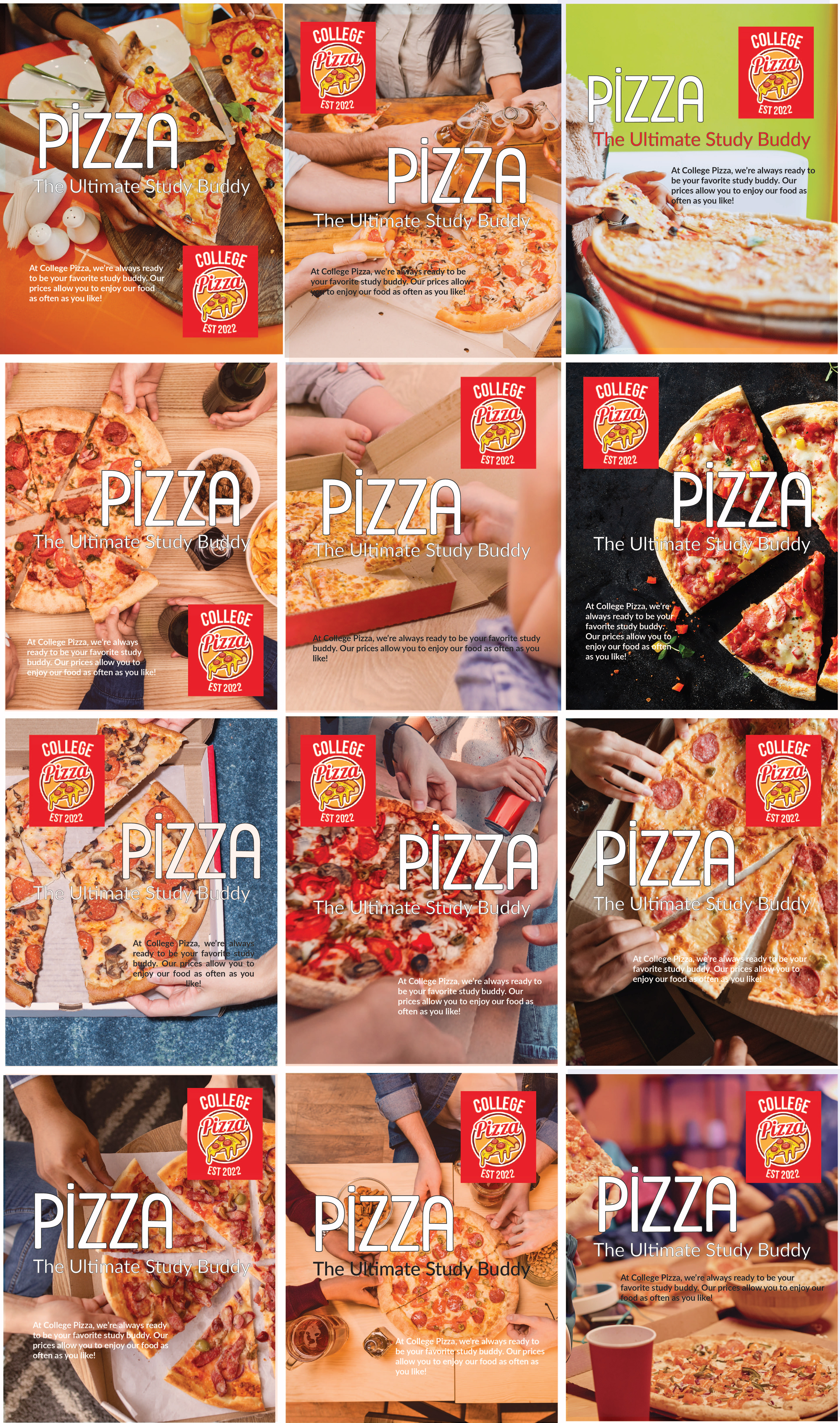


So, after making several different posters, I shared them with my family and friends and asked them to pick out their favorites. I gave them the basic details from the brief and let them know that I wanted the posters to give off a budget-friendly pizza place vibe. After getting their feedback, I narrowed my options to three and then made my final choice.
I found a cool image of hands reaching for a slice of pepperoni pizza from a cardboard box, and it's perfect for our target audience. The multiple sets of hands create a social atmosphere that will resonate with college students. Plus, the pizza looks like a budget-friendly option with its thin crust and single topping, and the cardboard box adds to that vibe. I also love that the image includes different skin tones, promoting diversity and inclusion.
For the fonts, I decided to pair Rabito Regular with Lato Bold. These fonts give off a youthful and affordable vibe, perfectly fitting our theme. I used white for the lettering to stand out against the image.
In terms of layout, I placed the word 'Pizza' front and center to catch the viewer's eye right away. The sub-heading, positioned near the word 'Pizza' in a smaller font, was designed to draw attention next. The longer text, placed in a corner in a slightly smaller font, was intended to be noticed last. Lastly, I positioned the logo in the top right corner to guide the viewer's eyes upwards and help them remember the pizza place's name.
This mockup addresses the concerns outlined in the brief. It conveys a budget-friendly aesthetic without looking cheap. It also effectively resonates with the target audience, making it relatable. I'm really excited about this design!