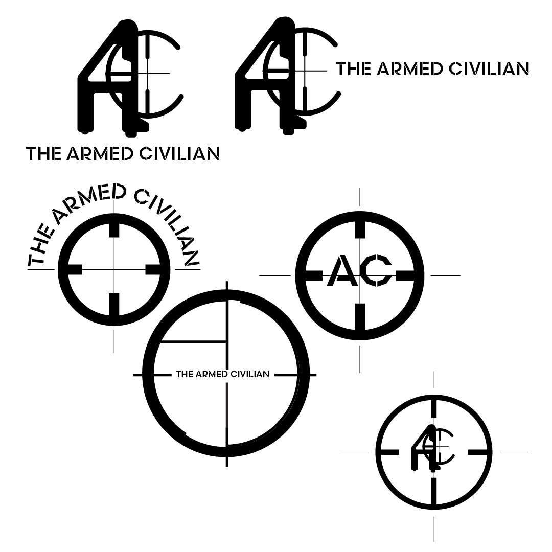
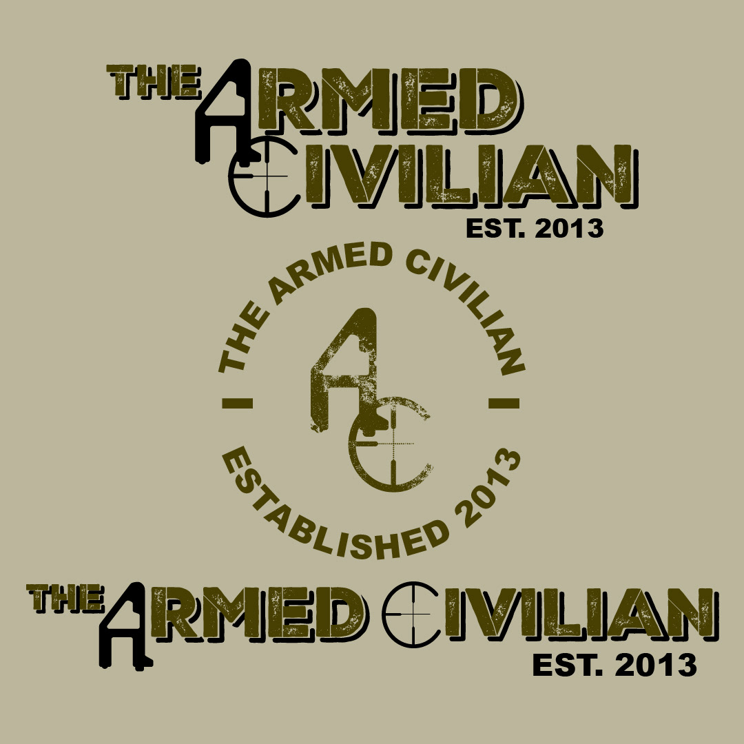
I recently worked on a branding project for a company that offers firearm training and sales. Designing the logo for this company was quite a challenge because it was my first time working in this field. The client wanted the logo to include a gun sight and a gun part that looks like an "A" when turned on its side. It took several attempts to create a design the client liked, but once we found the right concept, everything fell into place seamlessly.
Another challenge I faced was customizing a font to achieve a "military stamp lettering" look while retaining the texture the client liked. I added breaks in the letters to create a more military stamp font style. After finalizing all the logo components, I made several variations based on the client's preferences, which involved a lot of back-and-forth and tweaking. Ultimately, we settled on two variations of the full wordmark logo: a stamp-style logo and a plain letter mark, which the client was delighted with.

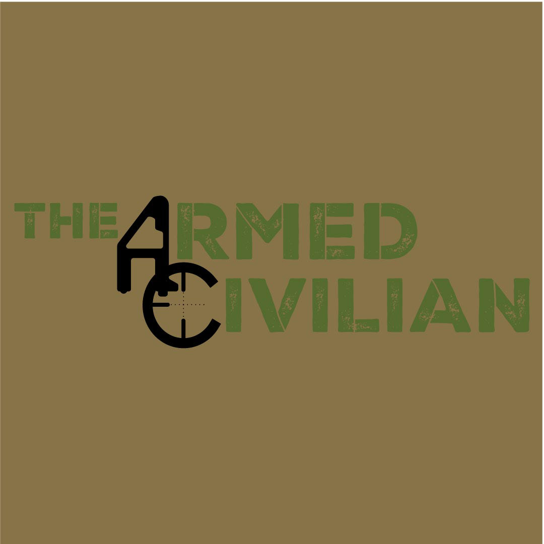








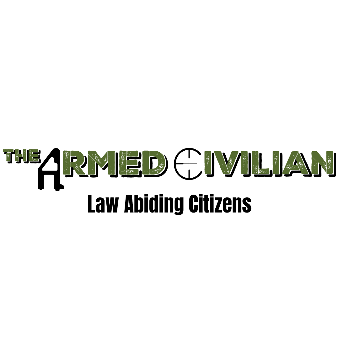
After finalizing the logo and wordmarks, we needed to choose a brand color palette. This was nearly as difficult as designing the logo. Initially, the client wanted a color palette with a military-inspired look. Therefore, we created a palette with many earth tones, such as browns, greens, and tans. While this palette aligned with the client's initial vision, it didn't have the distinctiveness the client desired to stand out.
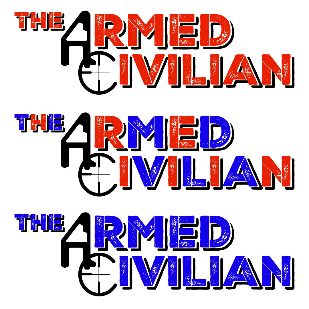
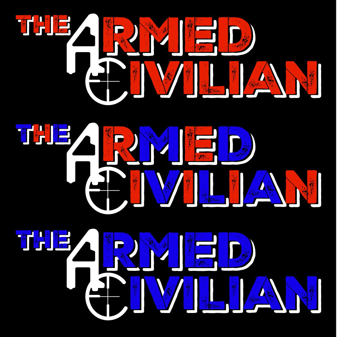
We also tried some less conventional color palettes, attempting to emphasize red, white, and blue. However, it felt more like a specialized logo for US holidays than a logo for a firearm company.
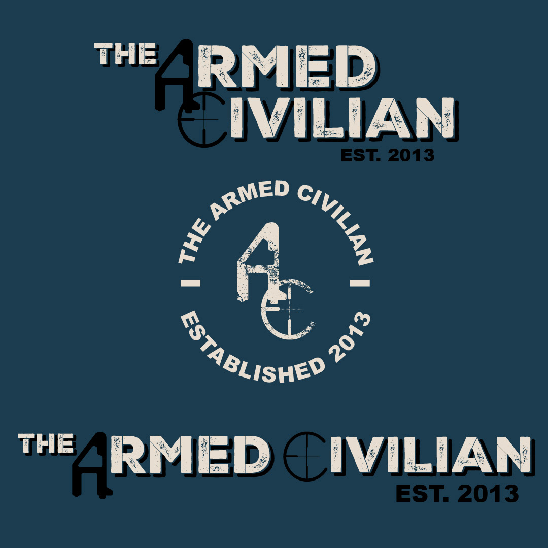
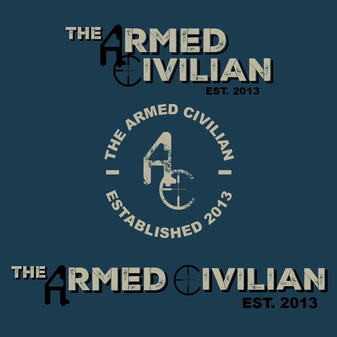
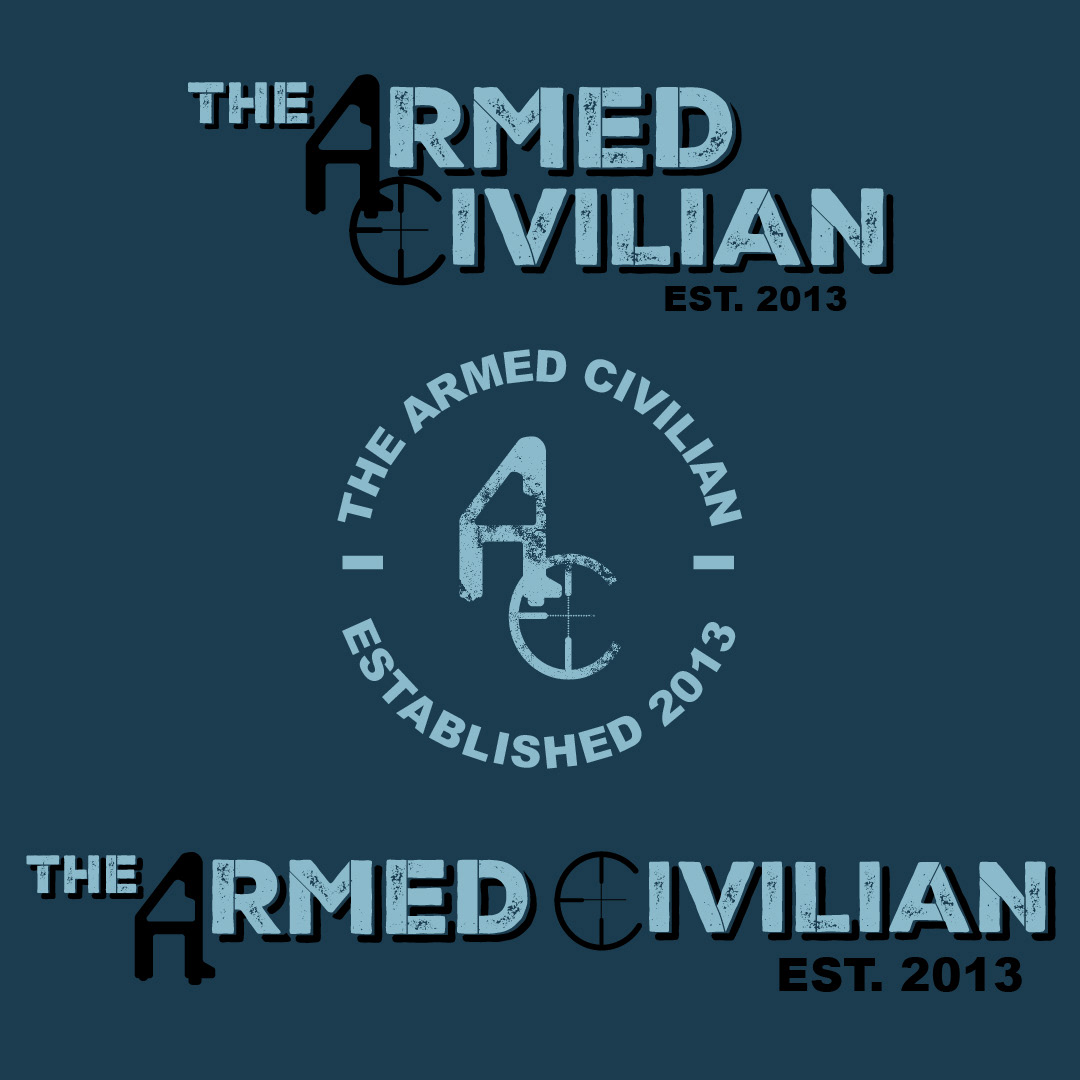
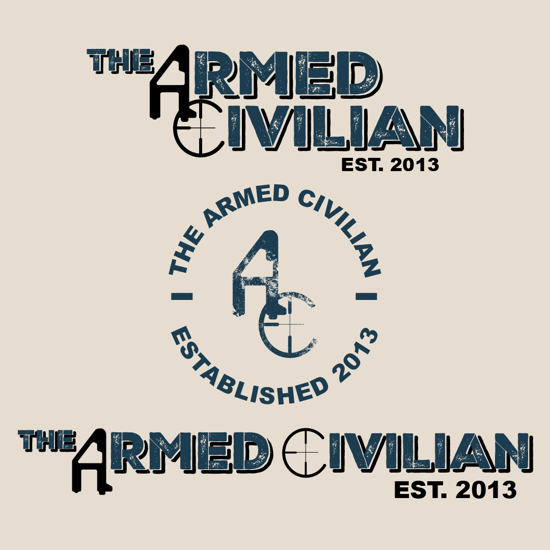

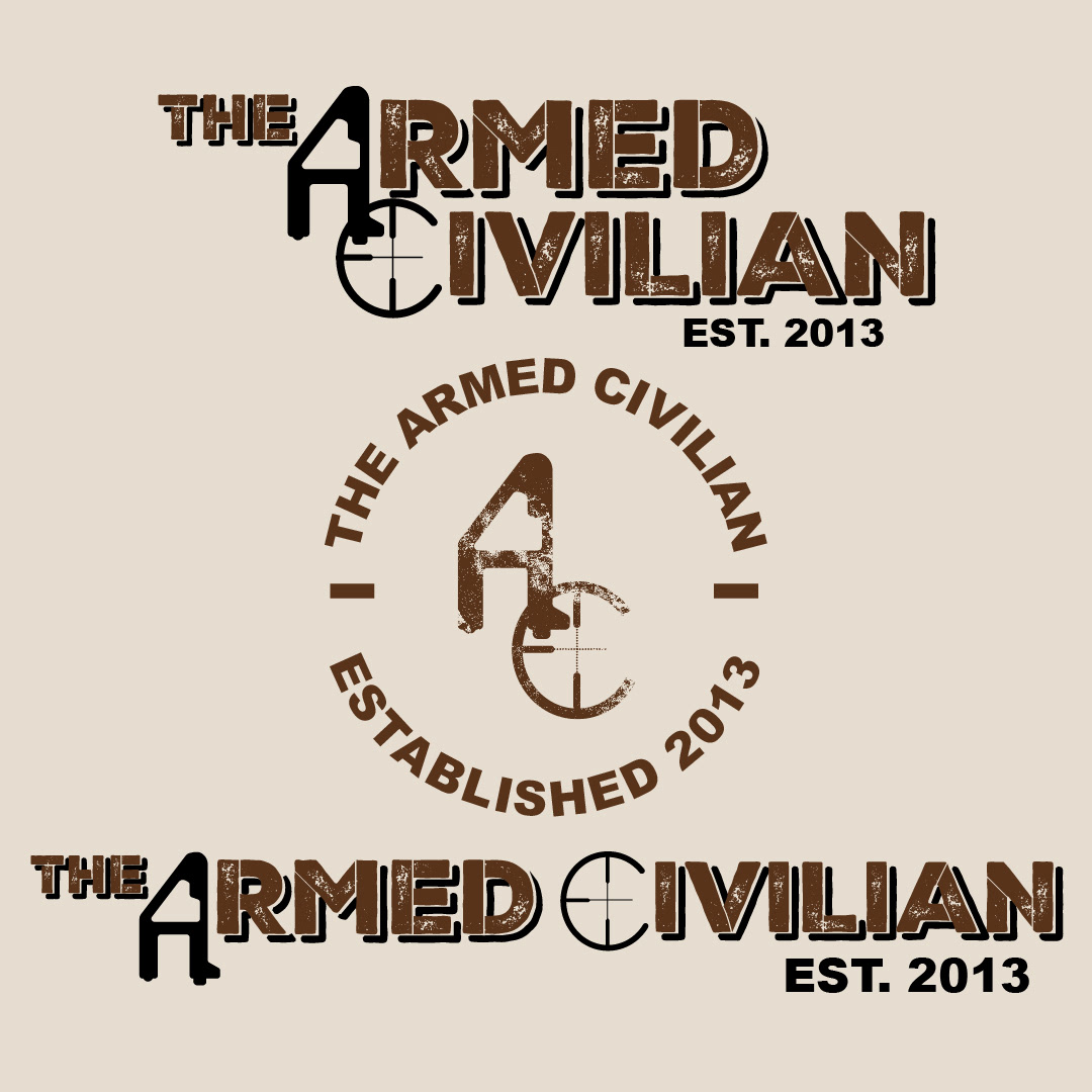
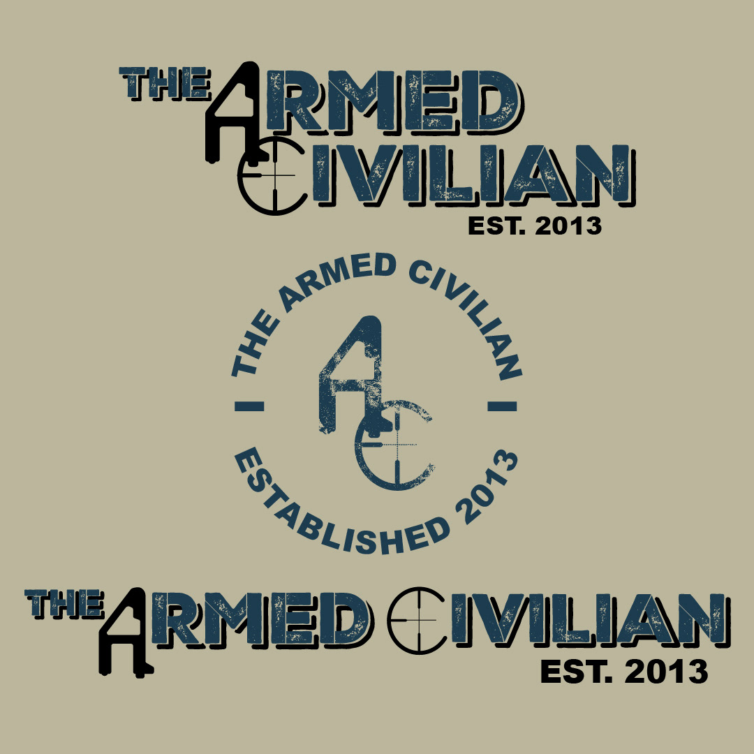

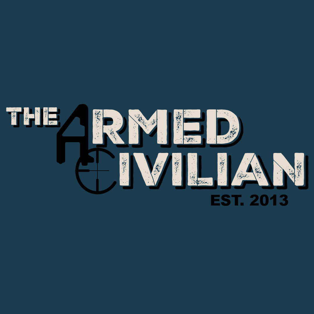
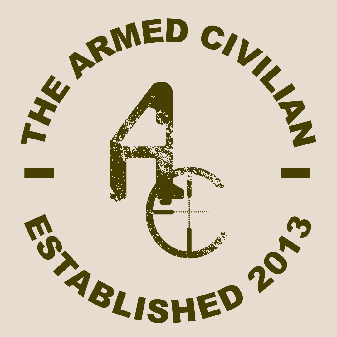

We decided to go with earthy colors mixed with a touch of blue. The deep navy blue was chosen for its calming effect, which is especially important for someone teaching firearm handling. We also found a lovely khaki green that pairs perfectly with the blue, creating a harmonious brand color palette.
Ultimately, I am incredibly proud of how this project turned out. The challenges we faced along the way made the ending even better.
